When designing a website you need to stand out and be unique; the font you use can reflect that.
Arial
We wouldn’t recommend this font as it looks plain, doesn’t stand out and looks unprofessional; there are so many other appropriate fonts out there that you could be using instead.
Comic Sans
Another font that is comes across as simplistic is Comic Sans. We would only suggest using a similar font to this when targeting a younger audience as it is easier to read. However, if this is used on a professional website your clients are less likely to take your business seriously.
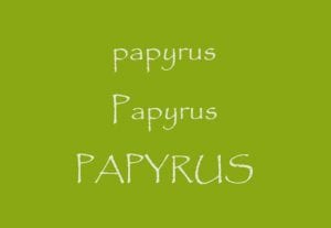
Papyrus
An outdated font such as Papyrus shouldn’t be used on business websites. Back in the 1980’s this font was deemed popular but the novelty of it has worn off now and it has definitely had its day.
Courier New
This font was designed to imitate traditional typewriting but it is most commonly used for coding and plain text.
Kristen ITC Regular
Likewise with Comic Sans, this is another simplistic font which doesn’t scream originality. However, as stated before, if your audience are younger then perhaps using a neat yet child-friendly font would be advised.


